General Knowledge - Organizing Large Amounts of Data
The term big data is used to describe extremely large amounts of constantly growing data.
- Sample V.S Population
A population is the entire group while a sample is a portion that you will collect data from.
In most cases, when calculating variance such as standard deviation of a sample, you devide by n-1 to get an unbiased result - Why Organizations Collect Data
Organizations collect data to customize content and improve the user's overall experience
E.g. Social Media Platforms (Youtube, Snapchat, Instagram) often ask questions about your interests, behaviors and demographics
Statistics Canada also conducts a servey called the "Census of Population" which helps the government focus on equity between funds and assistance - How Technology helps with the Collection of Data
Biometric Data involves analysing the physical characteristics of individuals
E.g. Common techniques involve: Fingerprint identification, facial regognition (Iphone Models) and voice recognition, (Google Home and Alexa) - Challenges with utilisation of Big Data
The data is large and complex to be handled by traditional data-processing softwares
High levels of computing power and storage space
Click on this link to view the code for the mini quiz on General Knowledge
Measures of Central Tendency
Central Tendency is a measure that describes the middle, or average, of a data set. The 3 measures include:
- Mean: The average value of a set.
The sample mean is denoted by x̄ while the population is denoted by μ - Median: The middle datapoint/term in a sorted set of values.
It must be sorted from least to greatest - Mode: The most frequently occurring of values.
There can be one or more modes. Two modes are called bimodal
Formulas for calculating these measures:
- Mean: μ = Σx/n and x̄ = Σx/n-1
For this reason, in a skewed distributed graph, the mean tends to be more affected
my the outliers, as you can see it sits near the tail of the right skewed graph in the image
to the right - Median: Depends on whether the number of datapoints (n) is odd or even.
For n is odd: The median = (n+1)/2
For n is even: The median = (n/2 term + n/2 + 1 term )/2 - Mode: The value(s) that occur with the highest frequency.
In a graph, it sits at the highest point of the graph, which is evident in the image to the
right
Measures of Spread
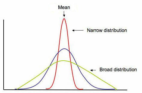
Measures of Spread describe how varied or similar a set of values are to one another.
Common measures include:
- Range: The difference between the maximum and minimum values of a set.
- Covariance: A measure of how two variables change together and how one correlates
with the other.
It indicates the direction (positive, negative or no association) - Standard Deviation: A measure of the amount of dispersion of data from one's mean.
The symbol is denoted by "σ" - Correlation Coefficient: A measure of the strength and direction of a linear relationship
(correlation) between two variables.
One way of measuring it is the Pearson's coefficent, which is denoted by "r" and is between
-1 and 1
Formulas for calculating these measures:
- Range: Max-Min
- Covariance: Cov(X, Y) = Σ(x-x̄)(y-ȳ)/-n-1
For a sample divide by n if your data is the population - Standard Deviation: σ = √[Σ(x-x̄)^2/
N-1]
Divide by N if your data is the population
The formula subtracts every value from the mean - Correlation Coefficient: Σ(x-x̄)(y-ȳ)/√[Σ(x-x̄)^2 Σ(y-ȳ)^2]
The formula finds the number of standard deviations that can be put into the covariance

Box Plots & Scatterplots
Graphing data provides visual representation. Key concepts include:
Box Plots:
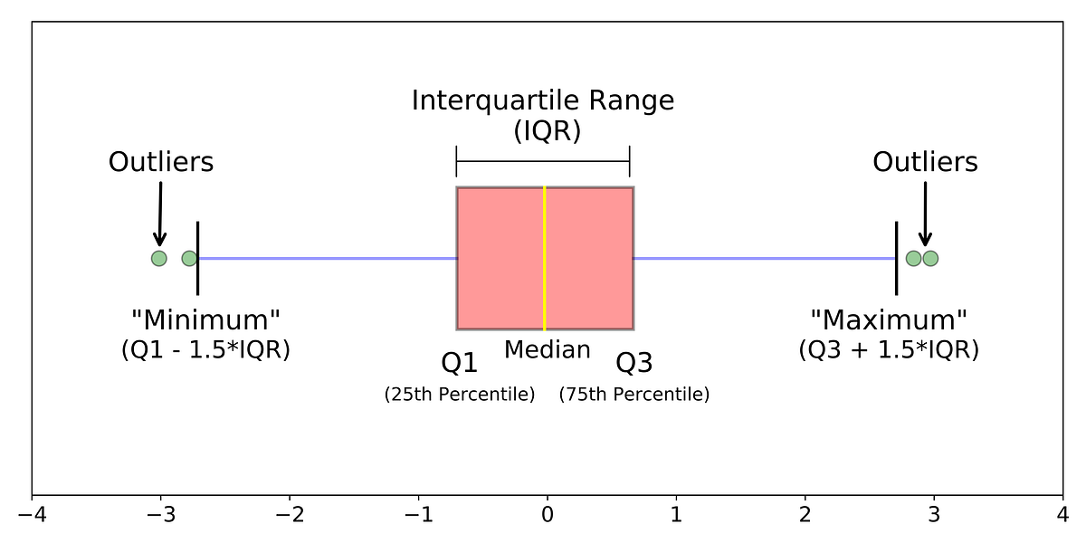
Here are the main components of a box plot:
- Lower Quartile (Q1): The median of the lower half of the dataset.
- Upper Quartile (Q3): The median of the upper half of the dataset.
- Median: The middle datapoint/term of the dataset.
- Interquartile Range (IQR): The range between Q1 and Q3.
- Finding Outliers: Outliers are displayed beyond the whiskers of a box plot.
They are defined as outliers if there are beyond the lower and upper quartile by 1.5 the interquartile range

Scatterplots:
- Regression Line: A line that best represents the relationship between two variables.
Practice:
WHICH LINE BEST FITS THE SCATTERPLOT?

Select option _____________________
WHAT DETAILS CAN YOU READ FROM THIS BOXPLOT?

Select option _____________________

Interactive code
Now you can view these concepts incorporated in a summative code I have created in Python!
Click on this link to view the code for the calculatorDescription:
Calculator of central tendency and measures of spread, as well as graphing data points
you input.
In order to calculate the mode and graph the points, you must have installed matplotlib
by going to the shell (located beside the console) and typing in "pip install matplotlib," for graphing and "pip install scipy" for mode. If this isn't possible, there are still
other tools such as calculating the correlation coefficient, mean, median and covariance.